ShopDreamUp AI ArtDreamUp
Deviation Actions


![Gem Fusion Ota!! [OPEN]](https://images-wixmp-ed30a86b8c4ca887773594c2.wixmp.com/f/767ae5d6-b588-4d0f-a019-477a703c1157/dass7l6-62d64c6b-38be-4e5f-a778-bbe48eab97b5.jpg/v1/crop/w_92,h_92,x_15,y_0,scl_0.038966539601864,q_70,strp/gem_fusion_ota____open__by_sleepystaceyart_dass7l6-92s.jpg?token=eyJ0eXAiOiJKV1QiLCJhbGciOiJIUzI1NiJ9.eyJzdWIiOiJ1cm46YXBwOjdlMGQxODg5ODIyNjQzNzNhNWYwZDQxNWVhMGQyNmUwIiwiaXNzIjoidXJuOmFwcDo3ZTBkMTg4OTgyMjY0MzczYTVmMGQ0MTVlYTBkMjZlMCIsIm9iaiI6W1t7ImhlaWdodCI6Ijw9NjIzIiwicGF0aCI6IlwvZlwvNzY3YWU1ZDYtYjU4OC00ZDBmLWEwMTktNDc3YTcwM2MxMTU3XC9kYXNzN2w2LTYyZDY0YzZiLTM4YmUtNGU1Zi1hNzc4LWJiZTQ4ZWFiOTdiNS5qcGciLCJ3aWR0aCI6Ijw9MTAyNCJ9XV0sImF1ZCI6WyJ1cm46c2VydmljZTppbWFnZS5vcGVyYXRpb25zIl19.mph1XSspER-6iYRjOnlGH5pRUDdnye9baH4bMTdMDwk)


Suggested Deviants


Suggested Collections


You Might Like…


Featured in Groups


Description
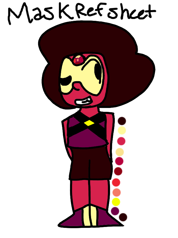
Here's the leader of my Ruby Squad! :3
Image size
600x800px 73.16 KB
© 2016 - 2024 SleepyStaceyArt
Comments18
Join the community to add your comment. Already a deviant? Log In
The shoulders are slightly too squared, and the toes are too triangular. I suggest rounding them more at the ends just so they look slightly more proportionate. The feet should be pointing in the same direction, or at least not in completely opposite directions.
There are also lots of very noticeable patches of white where colour should be. It happens a lot when you use the fill/bucket tool and have small corners or thin cracks where it just doesn't fill, so it's understandable, and an easy fix. It's just a lot better to maybe zoom in for a bit and check all of the corners before you decide it's finished. (like proofreading, but for art)
As for the teeth, you should try using a slightly smaller brush size. And the visor; rather than using a flat yellow, I recommend colouring the whole face underneath red, colouring over the section where the visor is supposed to be in yellow, and reducing the yellow layer's opacity, just a simple technique to sell that the visor is over the face rather than part of it.
Otherwise, the hair, palette, gem, and the outfit overall are lovely! I specifically like the visor and the Attack the Light style you took with it. Great work! ^^